Color plays a pivotal role in interior design, particularly when it comes to upholstery. It can set the mood of a space, influence perception, and even evoke emotions. Selecting the right color for your upholstery can enhance your home’s aesthetic and create a cohesive look. This article explores the psychological effects of color in upholstery choices and offers practical tips for incorporating color into your furniture selections. Whether you prefer bold statements or subtle tones, understanding color’s impact will help you curate a harmonious living environment.
Psychological Impact of Color
Colors have a profound psychological impact on our emotions and overall well-being. For instance, warm colors like red and orange can evoke feelings of excitement and energy, making them ideal for social spaces such as living rooms. In contrast, cooler colors like blue and green tend to create a sense of calm and tranquility, making them perfect for bedrooms or relaxation areas. Understanding these emotional responses can help homeowners make informed decisions when selecting upholstery that aligns with the desired atmosphere of their space.
Moreover, the use of color in upholstery can significantly influence how individuals perceive a room. A bright, vibrant upholstery can energize a space and make it feel more welcoming, while muted or neutral tones can create a sophisticated and serene environment. This psychological connection between color and ambiance highlights the importance of thoughtfully selecting upholstery colors that not only complement the decor but also foster the desired emotional experience for inhabitants and guests alike.
Trends in Upholstery Colors
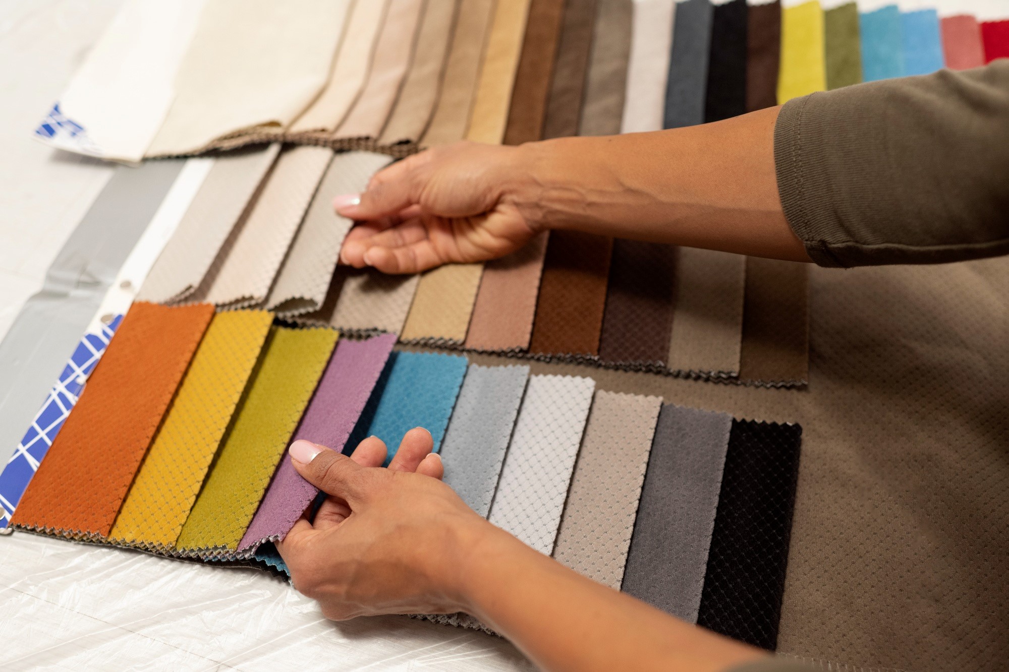
Current trends in upholstery colors are heavily influenced by broader cultural movements and societal changes. As sustainability and wellness take center stage, many designers are opting for earthy tones and natural colors that reflect a connection to nature. Popular color palettes often include shades like sage green, terracotta, and muted browns, promoting a sense of calm and balance in interiors.
Some key trends in upholstery colors include:
- Earthy Tones: Rich greens, browns, and warm neutrals that create a grounded atmosphere.
- Bold Accents: Vibrant colors like deep teal or mustard yellow used as accent pieces to add energy to neutral spaces.
- Pastels: Soft pastels such as blush pink and light lavender that evoke a sense of tranquility and lightness.
- Monochromatic Schemes: Layering different shades of the same color for a cohesive and sophisticated look.
These trends reflect a desire for comfort and connection, highlighting how color choices in upholstery can enhance the emotional and aesthetic quality of a living space. As consumers become more conscious of their environments, selecting upholstery colors that resonate with personal values and current trends becomes increasingly important.
Color Theory Basics
Understanding color theory is essential when making upholstery choices, as it helps create harmony and balance within a space. The fundamentals of color theory include the relationships between primary, secondary, and complementary colors. Primary colors—red, blue, and yellow—serve as the building blocks for all other colors, while secondary colors, formed by mixing primary colors, offer additional options for creating visually appealing combinations. Complementary colors, which are opposite each other on the color wheel, can create striking contrasts that enhance the overall aesthetic.
In upholstery design, applying these principles can lead to more thoughtful and intentional choices. For instance, pairing a bold upholstery fabric with a complementary hue can draw attention to a specific piece of furniture, while a monochromatic approach can create a cohesive and sophisticated look. By understanding these basic concepts of color theory, homeowners and designers can make more informed decisions that not only reflect personal style but also enhance the overall visual impact of a room.
Color and Space Perception
The perception of space is significantly influenced by color choices in upholstery. Light colors can make a room feel more open and airy, creating an illusion of spaciousness. Conversely, dark colors tend to absorb light, which can make a space feel cozier but also smaller. To illustrate this concept, the table below highlights how different colors affect the perception of room dimensions:
| Color Category | Effect on Space | Best Used In | Recommended Shades | Tips for Use |
| Light Colors | Makes space feel larger | Small rooms, ceilings | Soft white, pastel blue, pale yellow | Use for larger upholstery pieces to enhance openness |
| Dark Colors | Creates a cozy atmosphere | Larger rooms, accent pieces | Charcoal, deep navy, rich burgundy | Use sparingly as accents to avoid overwhelming the space |
| Bright Colors | Adds energy and vibrancy | Social areas, playrooms | Vibrant red, electric blue, bright green | Balance with neutral tones to prevent overstimulation |
| Neutral Colors | Creates a calm, balanced feel | Any room type | Beige, gray, taupe | Serve as a versatile backdrop for colorful accents |
| Monochromatic | Creates cohesion and elegance | Open concept spaces | Varying shades of the same color | Mix textures to add depth while maintaining a unified look |
Choosing the right upholstery color based on these principles can enhance the desired atmosphere within a room. For instance, in smaller spaces, using light-colored upholstery can make the area feel more expansive and inviting, while darker shades can be utilized in larger rooms to create warmth and intimacy.
In addition to color, factors such as texture and pattern also play a crucial role in space perception. Combining different textures can add dimension to a room, while patterns can draw the eye and create focal points. By carefully considering how color interacts with space, homeowners can create environments that not only look aesthetically pleasing but also feel comfortable and functional.
Color Coordination with Existing Decor
When selecting upholstery colors, it’s essential to consider how they will coordinate with existing decor to achieve a cohesive and harmonious look. Successful color coordination can enhance the overall aesthetic of a space and create a more inviting atmosphere. Start by analyzing the primary colors present in your furniture, walls, and accessories. This helps identify a palette that complements the current decor without overwhelming it.
Key strategies for effective color coordination include:
- Identify Dominant Colors: Determine the main colors in your room, such as wall paint or large furniture pieces, and choose upholstery that harmonizes with these hues.
- Use the 60-30-10 Rule: Allocate approximately 60% of the room’s color to walls and larger items, 30% to upholstery, and 10% to accent colors through accessories. This balance helps maintain visual interest while ensuring cohesiveness.
- Consider Texture and Pattern: Incorporating different textures and patterns can add depth to the color scheme. For instance, pairing a solid upholstery color with patterned throw pillows can create a dynamic yet cohesive look.
- Select Complementary or Analogous Colors: Choose colors that are either complementary (opposite on the color wheel) or analogous (next to each other) to create visual harmony. This ensures the upholstery enhances the overall decor rather than clashes with it.
- Test Samples: Always test fabric samples in the room’s lighting before making a final decision. Colors can look vastly different under natural and artificial light, so it’s crucial to see how they interact with the space throughout the day.
By implementing these strategies, homeowners can create a well-coordinated environment where upholstery choices enhance rather than detract from the existing decor. Thoughtful color coordination not only elevates the aesthetic appeal but also fosters a sense of unity throughout the space.